Retention is the single most important metric in casino product design. Acquisition costs in iGaming are among the highest of any industry — getting a player to register is expensive. Keeping them is where profit is made.
Most operators invest heavily in bonuses and promotions to drive retention, yet under-invest in the UI layer that determines whether those bonuses are even discovered, let alone redeemed. The design of your casino lobby is a retention tool — and most operators aren't using it like one.
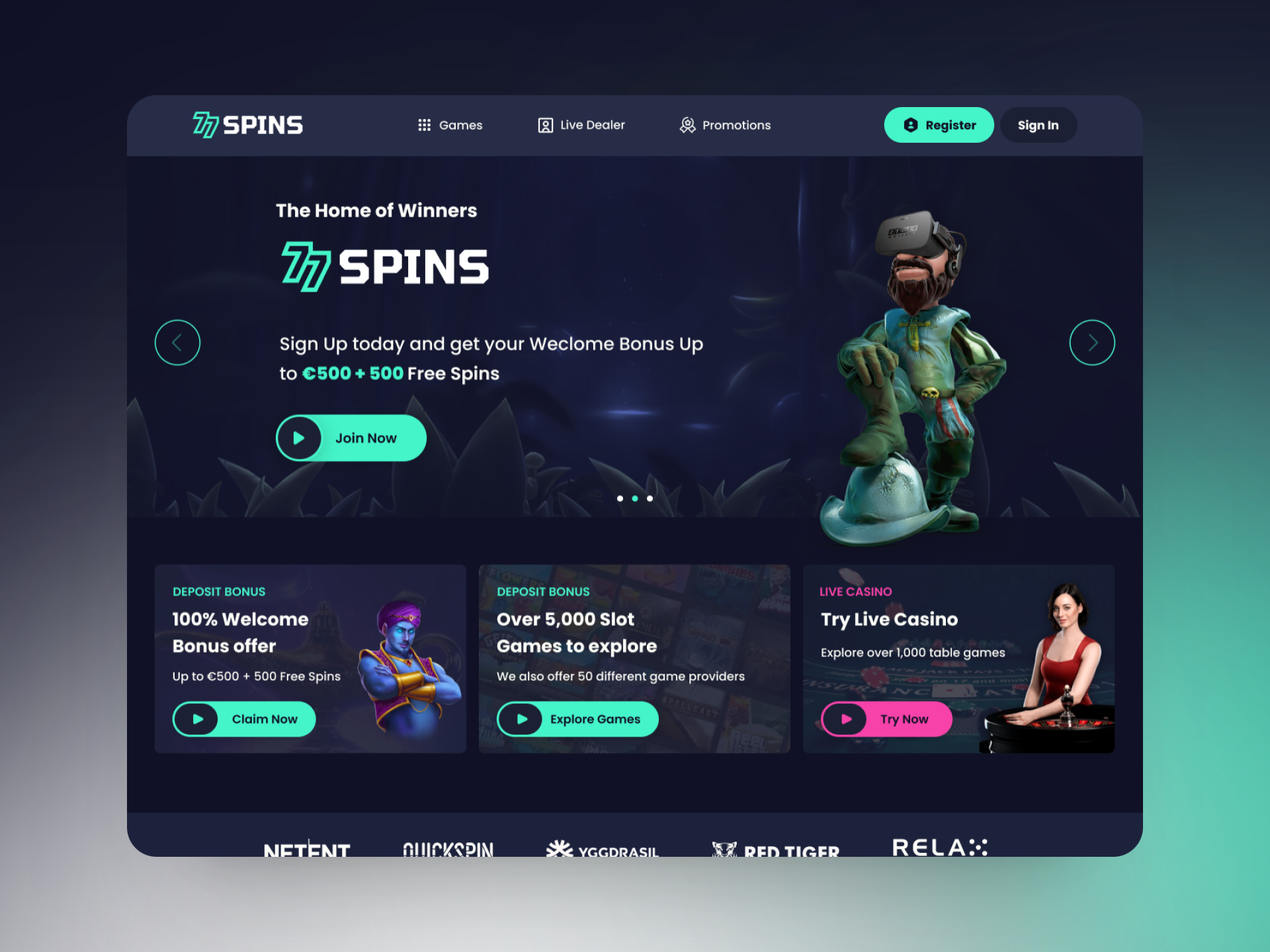
The First 30 Seconds Are Everything
Player decisions about whether to stay or bounce happen in the first 30 seconds of a session. In that window, the lobby needs to answer three questions instantly:
- What games are available to me right now?
- Is there a bonus or promotion waiting for me?
- Where do I start?
Most casino lobbies fail this test. Game grids are unsorted or sorted by provider rather than player relevance. Promotions are buried in a secondary tab. The call to action hierarchy is flat — everything competes for attention, so nothing gets it.
Personalisation Starts With Layout, Not AI
You don't need a machine learning recommendation engine to create a personalised lobby. You need a layout system that surfaces contextual content at the right time.
A returning player who last played slots at 9pm should see their recently played games above the fold. A new player should see a curated "Start here" section with low-variance games and a clear bonus hook. These are structural design decisions, not engineering problems — and they can be solved in Figma before a single line of code is written.
Navigation Depth Kills Conversion
Every additional click between a player and their next game is a churn risk. We've audited platforms where the path from lobby to a specific live dealer table requires four interactions. Players don't persist through friction — they leave.
The gold standard is one click from the lobby to gameplay. This requires a flat navigation architecture, persistent search, and contextual quick-launch cards on the homepage. It's not complex to design — but it requires prioritising player flow over operator convenience.
Bonus Visibility Is a Design Problem
In our lobby audits, we consistently find that operators have generous bonus programmes that players aren't aware of. The bonus tab gets fewer than 12% of clicks despite being in the main navigation. Why?
Because a tab label doesn't communicate value. A persistent banner that says "Your 100 free spins expire in 2h 14m" does. Urgency and relevance drive clicks. Static navigation labels don't.
Mobile Is Not a Smaller Desktop
Over 70% of casino traffic is now on mobile, yet most casino UIs are designed desktop-first and adapted down. The results are predictable: oversized grids, tap targets that miss, and scroll depths that exceed 10 screens to reach anything meaningful.
Mobile casino design requires a different information architecture entirely. Bottom navigation, swipe-based category browsing, and card-based game discovery are native to mobile. Responsive CSS is not the answer — a separate mobile design system is.
The Practical Takeaway
If you're seeing high bounce rates, low games-per-session, or poor bonus redemption, the problem is almost certainly in the UI before it's in the product. Start with a 30-second lobby audit: open your platform fresh (clear cookies, no account state) and time how long it takes to answer the three questions above.
If you can't answer them in under 5 seconds, your design is working against your retention. That's fixable — and usually faster to fix than most operators expect.
Written by tilldawn® Studio — iGaming design specialists based in Malta.
Talk to us about your casino design →